gmx_MMPBSA_ana v1.5.x: The analyzer tool
Overview
gmx_MMPBSA_ana is a simple but powerful analysis tool. It is mainly focused on providing a fast, easy and efficient access to different graphics and analyze gmx_MMPBSA results (Figure 1). In this version, gmx_MMPBSA_ana includes a number of options to customize graphs and save high-quality figures. The tool has been optimized to work with many charts (check this section to learn about the potential of gmx_MMPBSA_ana). It conserves the essence of its predecesor gmx_MMPBSA_ana v1.4.3, although the API that uses in the backend is quite different, making it incompatible with files from previous versions.
Fast like a rocket
After version 1.5.2 gmx_MMPBSA_ana presented serious performance problems. We set ourselves the task of improving it from the ground up and these are the results:
This version = v1.5.5
| Number of systems/CPUs | Type | Frames | v1.5.2 | v1.5.2+20 | This version | Improvement |
|---|---|---|---|---|---|---|
| 1 | Energy | 200000 | fail | 960s | 17s | 56x |
| 4 | Energy | 200000 | fail | 4515s | 17s | 265x |
| 1 | Energy+Decomp(per-wise) | 11 | fail | 192s | 9s | 21x |
| 4 | Energy+Decomp(per-wise) | 11 | fail | 960s | 14s | 69x |
To this end, we have made the following changes:
- Reimplemented multiprocessing for reading systems.
- Implemented multithreading for data processing.
- Improved the reading of output files and optimized data storage.
- Eliminated the recalculation of IE and C2 entropies before opening the GUI. Now read from outputs files.
- Optimized data storage and access to subsets in panda's Dataframes.
- Now file processing and graphics generation does not freeze the GUI.
- Removed redundant steps and data.
- Removed line graphs for components in the per-wise decomposition schema.
- Data access, processing, and storage are done in the API.
- Added the option to temporarily store data on the hard disk instead of memory.
- Removed several pop-up windows.
- Added waiting indicators.
- Added multiple systems, subsystems, and component selection options.
gmx_MMPBSA_ana components
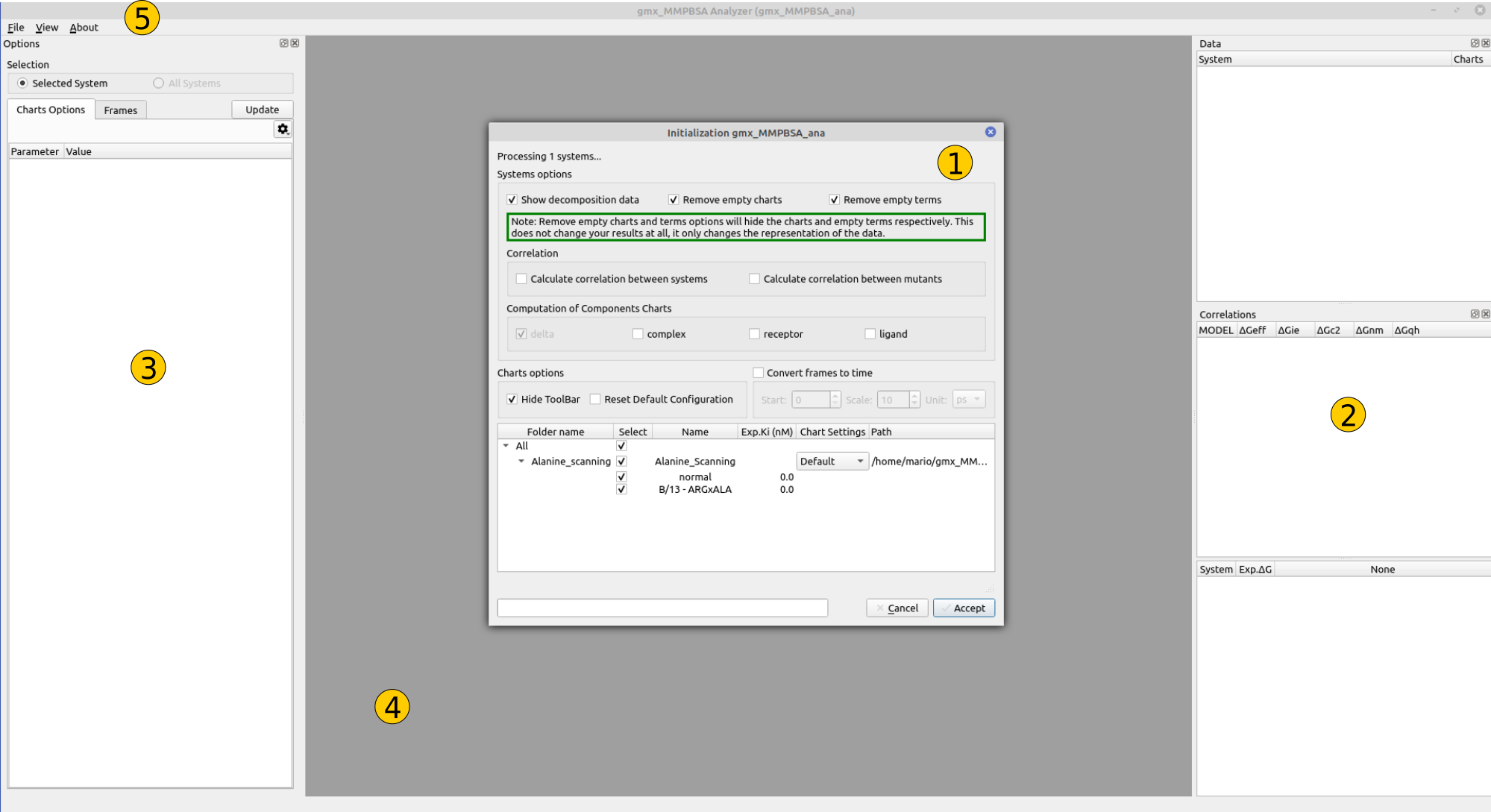
Figure 1. gmx_MMPBSA_ana graphical overview
1- System selection window
This dialog allows you to select the system(s) of interest, as well as its components. In this panel you can check a number of options that will define how gmx_MMPBSA_ana process the result file. These options are:
- select whether you want to include mutants, normals, or both systems when analyzing alanine scanning results
- delete the terms whose values during the analysis were between
-0.01and0.01 - show/not-show decomposition analyses (which usually contains lots of data)
- transform the frames range to timescale
- calculate the correlation between various systems
This allows you to take advantage of the flexibility of gmx_MMPBSA to carry out several analysis types in the same run and focus on the key elements for each of these analyses.
2- Data/Correlation panel
This panel is made up of two independent sub-panels: Data and Correlation with slightly different characteristics, but with the same essence.
Structure
This panel is tree-like, where each system marked in gray is a top-level element that contains a set of 'children' elements organized according to the calculation type. Each upper-level element can be expanded/collapsed, which allows you to take advantage of the space and manipulate a considerable number of systems at the same time while keeping the elements of interest at sight.
We are working on its implementation.
Buttons and Actions
Each item represents a set of data associated with a type of calculation, and a component (i.e. complex, receptor, ligand, delta, etc...). These, in turn, have buttons and actions depending on the data they contain. Each item can have a total of 7 buttons that represent:
| Button | Visual element | Description |
|---|---|---|
| Result files | Show/hide in a new sub-window the gmx_MMPBSA output files: FINAL_RESULTS_MMPBSA.dat and FINAL_DECOMP_MMPBSA.dat | |
| Line plot | Show/hide in a new sub-window a Line plot | |
| Bar plot | Show/hide in a new sub-window a Bar plot | |
| Heatmap | Show/hide in a new sub-window a Heatmap plot | |
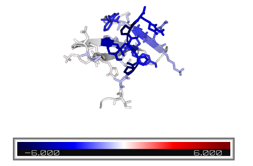
| PyMOL visualization | Show/hide the complex per-residue energy representation in a new PyMOL instance | |
| Summary table | Show/hide the summary table of the parent element with multiple energetic components as 'childrens' | |
| Multiple activation button | Show/hide all items (Line, bar, heatmap plots and PyMOL) at the same time |
In turn, some buttons have a drop-down menu that allows you to display the content of that specific graph in table form. In particular, the multiple activation button allows you to show/hide all the visual elements associated with a certain item.
Example:
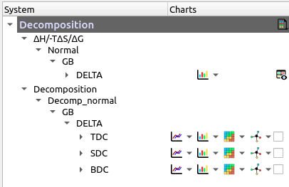
Figure 2. Button representation example
3- Options panel
In this panel you can find two tabs:
Contains five different menus:
Generalcontrols settings such as theme, figure-save-format, etc.Line Plotcontrols line plots settings such as line-width, line-color, rolling-average line appearance, etc.Bar Plotcontrols bar plots settings such as bar-color, bar-label appearance, etc.Heatmap Plotcontrols heatmap plots settings such as receptor- and ligand-colors, color-palette, etc.Visualizationcontrols PyMOL visualization settings such as color-palette, background-color, representation, etc.
Contains two windows:
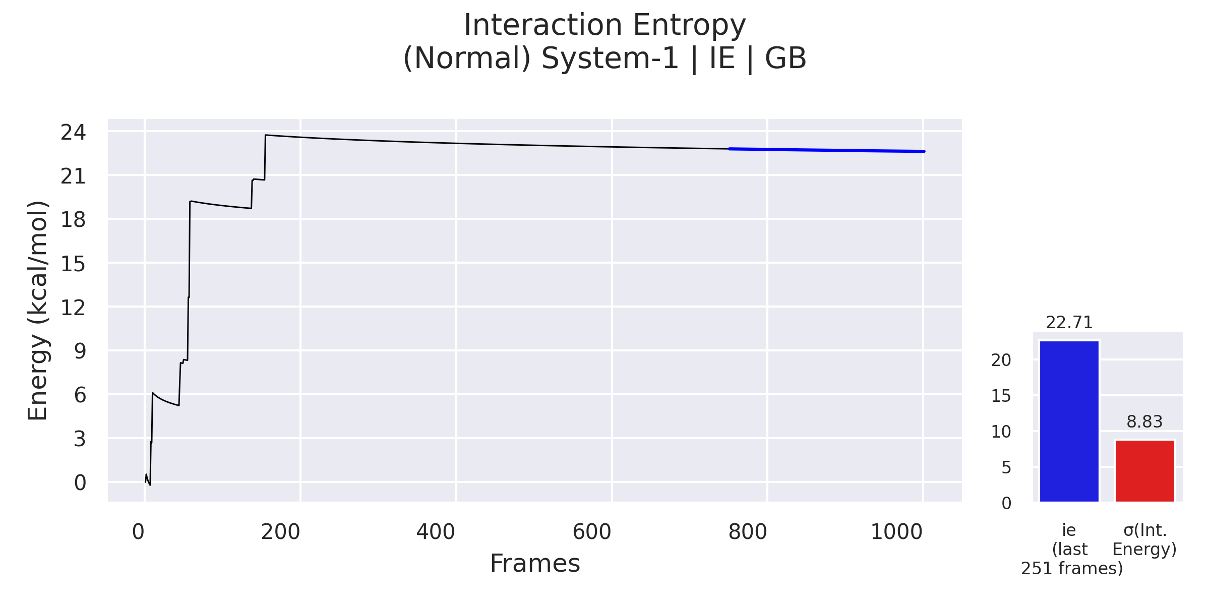
Energychanges start, end and interval between frames.IEchanges segment considered for calculating the Interaction Entropy.
4- Plot area
In this area, the graphs and tables included in each system will be displayed in the form of sub-windows (multi-document interface). This format allows you to move, resize and close each sub-window, offering a clean, organized, and fluid workspace to analyze a vast number of graphs.
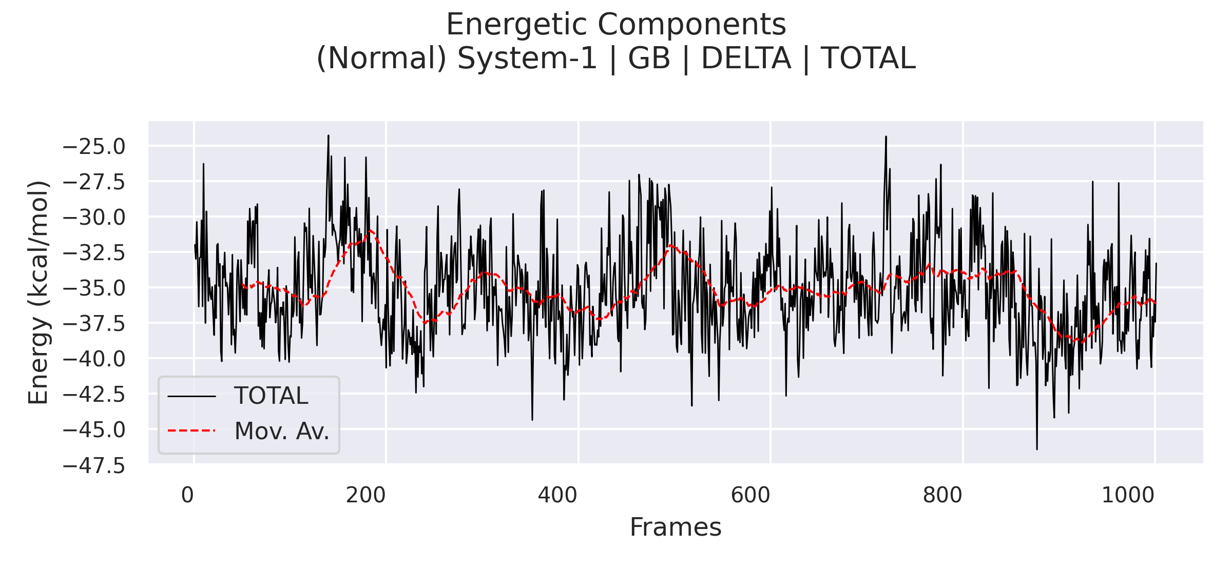
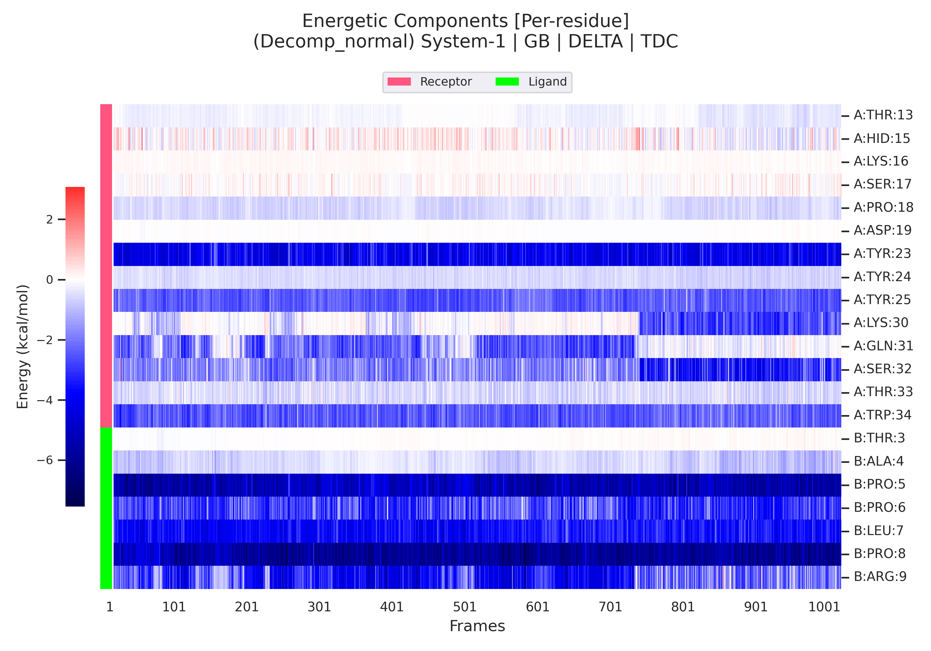
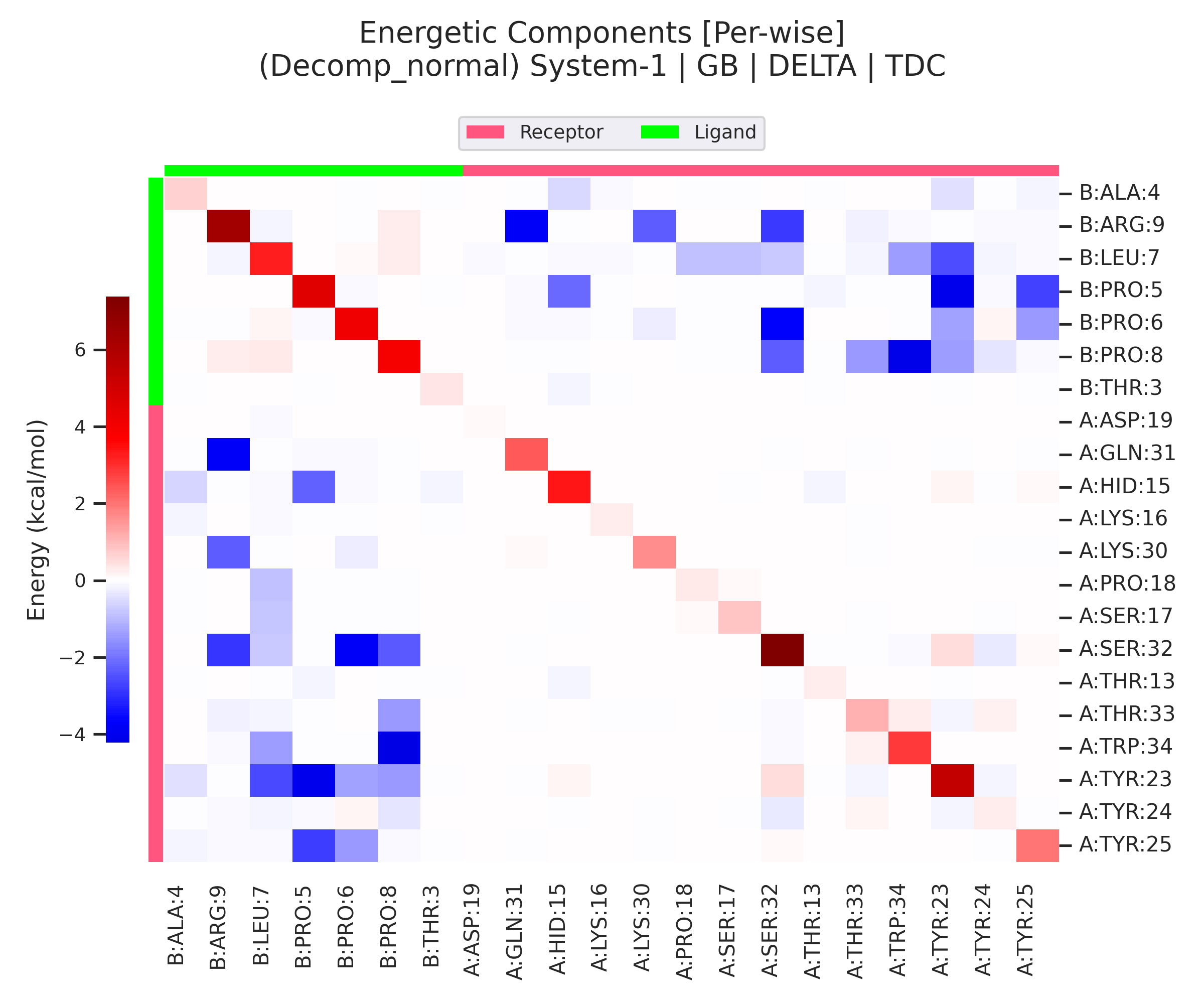
Types of charts
Represents the evolution of a component during the simulation time. In some cases, it is the value of the calculated parameter, e.g.: TOTAL DELTA, VDWAALS, etc.; and in others, it is the sum of the elements it contains, eg: TDC as the sum of all the per-residue energy contributions.
Note
The line plot can additionally contain the moving average (solid red line) or other elements such as other indicators (dash red and green lines).
Warning
Note that TDC, SDC, and BDC are calculated from the immediate items contained within themselves. This means that the results obtained for the TDC in a per-residue calculation will probably be different from the TDC of a per-wise calculation with the same residues. This is because the per-residue energy contribution is calculated taking into account the environment that surrounds each residue, so the sum of their contributions will be exactly the maximum contribution per selected residues. On the other hand, in the per-wise calculation, the TDC will be equal to the sum of each residue contribution, the difference being that the contribution of each residue is obtained from the contributions of the selected pairs and not with all the environment that surrounds it. Therefore, both calculations should be used for different purposes and care should be taken with the interpretation of the results.
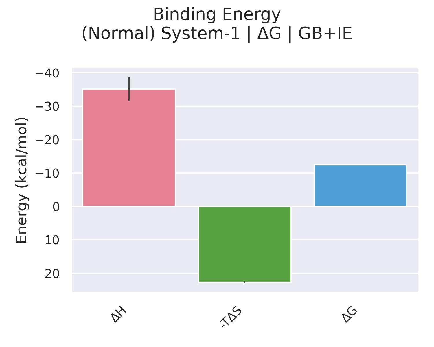
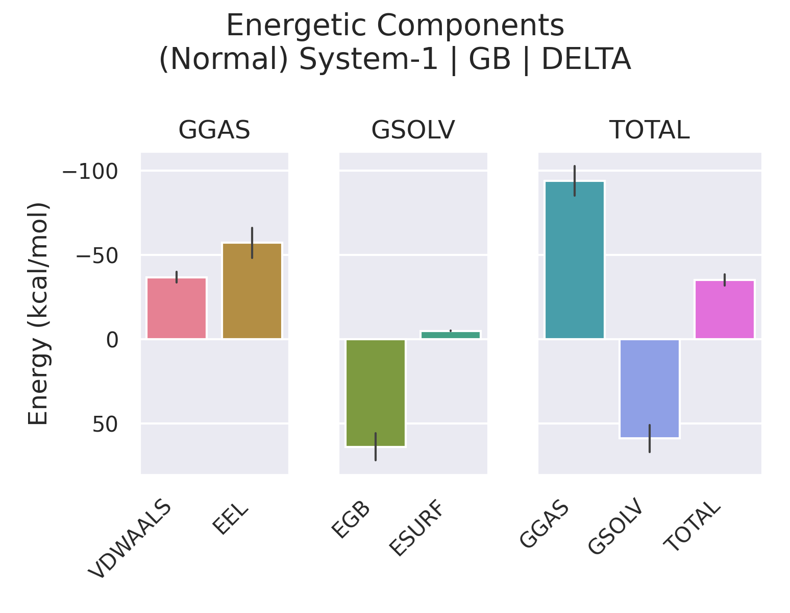
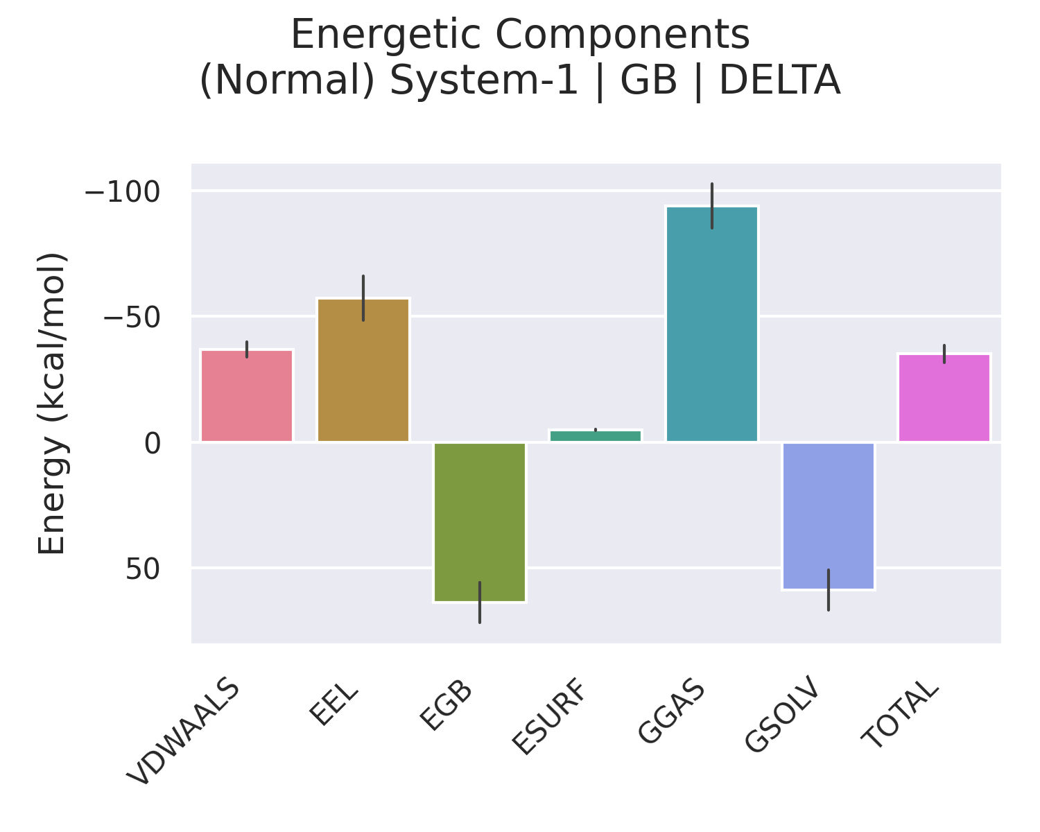
Represents the total contribution of a component for the simulation. In some cases, it is the average of the calculated parameter, e.g.: TOTAL DELTA, VDWAALS, RESIDUES in per-residue calculation, etc., and in others, it is the sum of the elements it contains, e.g.: NMODE and QH Entropy, ΔG Binding, etc. The bars that represent averages also have a solid line that represents the standard deviation.
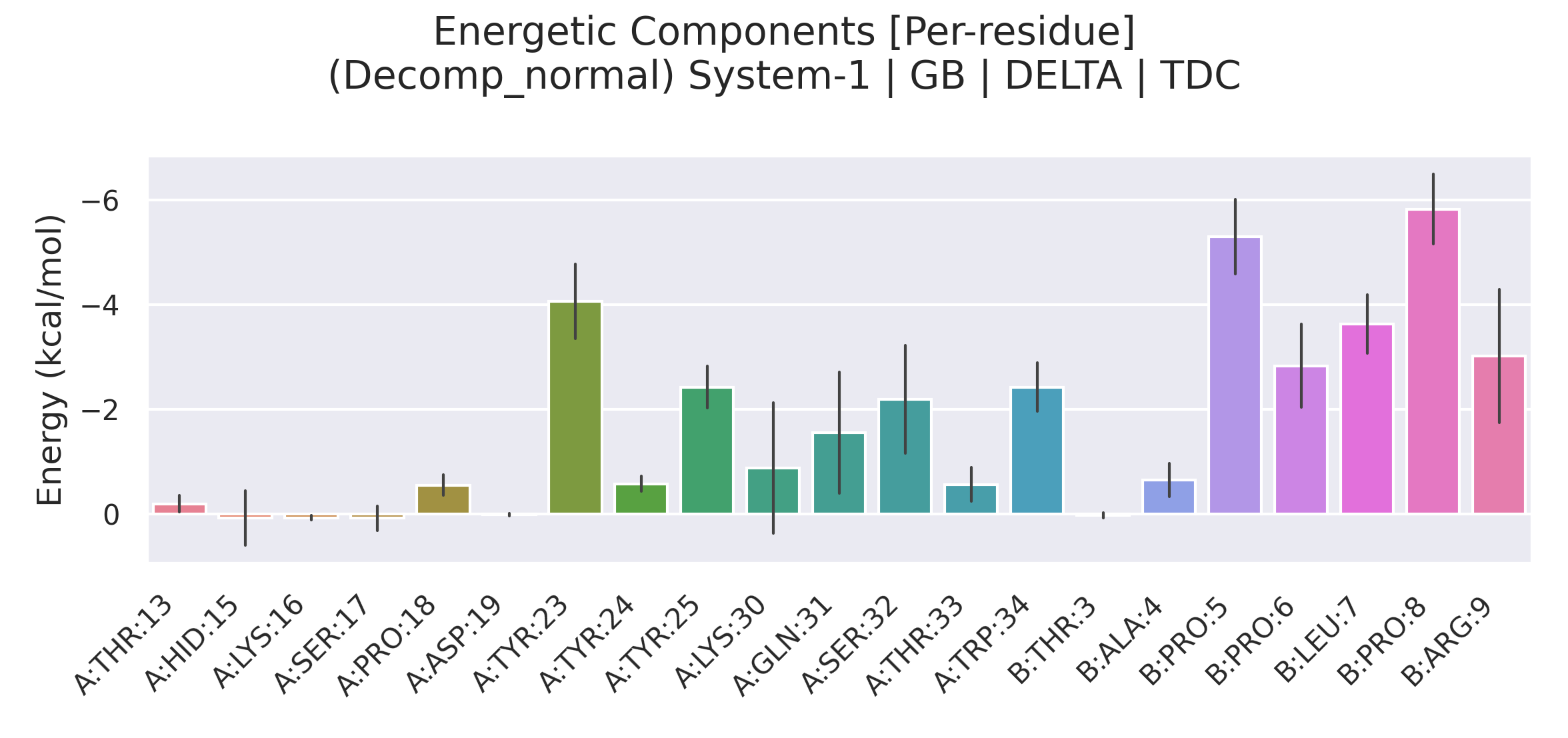
Represents the evolution of several components at the same time during the simulation. It is used to represent the contribution of all residues in per-residue calculation or all pairs of atoms for each residue in the per-wise calculation. It could also represent the relationship between components. This is explicit for per-wise calculations and represents the contribution of each residue with its respective pairs.
Tip
The relational heatmap graph is the best representation in the per-wise analysis.
Shows the complex per-residue energy representation in a new PyMOL instance.
5- Menus
This section contains three drop-down menus:
- Close all -- closes all the graphs
- Show Data -- shows data subpanel
- Show Correlation -- shows correlation subpanel
- Show Options -- shows options panel
- Tile SubWindows -- organizes graphs as tile
- Cascade SubWindows -- organizes graphs as cascade
- Help -- shows gmx_MMPBSA_ana page
- Documentation -- shows gmx_MMPBSA page
- Report a bug -- opens issue and report a bug on GitHub
- Google group -- opens gmx_MMPBSA Google Group
- About gmx_MMPBSA_ana -- shows gmx_MMPBSA citation
Representations
Note
The following videos provide a visual medium to facilitate the use of gmx_MMPBSA_ana. These videos were recorded with the previous version of gmx_MMPBSA_ana, v1.4.3. We are working with several content creators to provide more accurate video tutorials.
If you find our tool useful and want to use it for a visual project, such as tutorials, examples, etc., we will gladly include it in the documentation as well as in the list of acknowledgments and collaborators.
Functionalities
Binding Free Energy calculation (GB + IE)
Alanine scanning
Per-residue decomposition
gmx_MMPBSA_ana under pressure
Warning
Around 1.8 million graphs were loaded in gmx_MMPBSA_ana, and it is showed only for educational purposes.
In this experiment, we replicated our examples folder 9 times (differs from the one available on GitHub) giving us a total of 99 systems. As you can see in the video, gmx_MMPBSA_ana manages to deal well with the incredible amount of ~1.6 million items. Every item contains between 1 and 3 graphics, for a total of ~1.8 million graphics loaded. This feat is accomplished in ~11 minutes. Most of this time is consumed processing the data associated with each graph. At the moment, gmx_MMPBSA_ana processes this data serially, since parallelizing this process would be a bit difficult. In any case, for the usual processes, this will take a maximum of 25-30 seconds, depending on your hardware. Each item has associated the data of each of its graphs, which is stored in memory. In this experiment, RAM consumption reached up to 14 GB.
Danger
Be aware that if you run out of available RAM, your OS could crash, freeze, or slow down.
Does this mean that you will not be able to load 100 systems in gmx_MMPBSA_ana? Not at all. Consumption depends on the type of calculation you have made, and the data you want to analyze. In this experiment, there were several systems that contain the decomp data. We also selected to show the complex, receptor, and ligand data, which usually can be skipped. Only a system calculated with per-wise selecting about 40 amino acids generates about 11 thousand items.
Created: February 8, 2021 07:10:13